.png)


.png)
Living with a chronic illness affects millions of Americans, requiring complex daily health management that extends beyond medical care into all aspects of life. According to the CDC, 6 in 10 U.S. adults have at least one chronic disease, and 4 in 10 manage multiple conditions. This means that over 133 million people face challenges balancing health monitoring, personal care, and household tasks while navigating the physical and mental toll of their conditions. Current solutions often target specific conditions or focus on certain demographics, such as seniors, which can leave gaps in comprehensive support for those who don’t fit these categories.
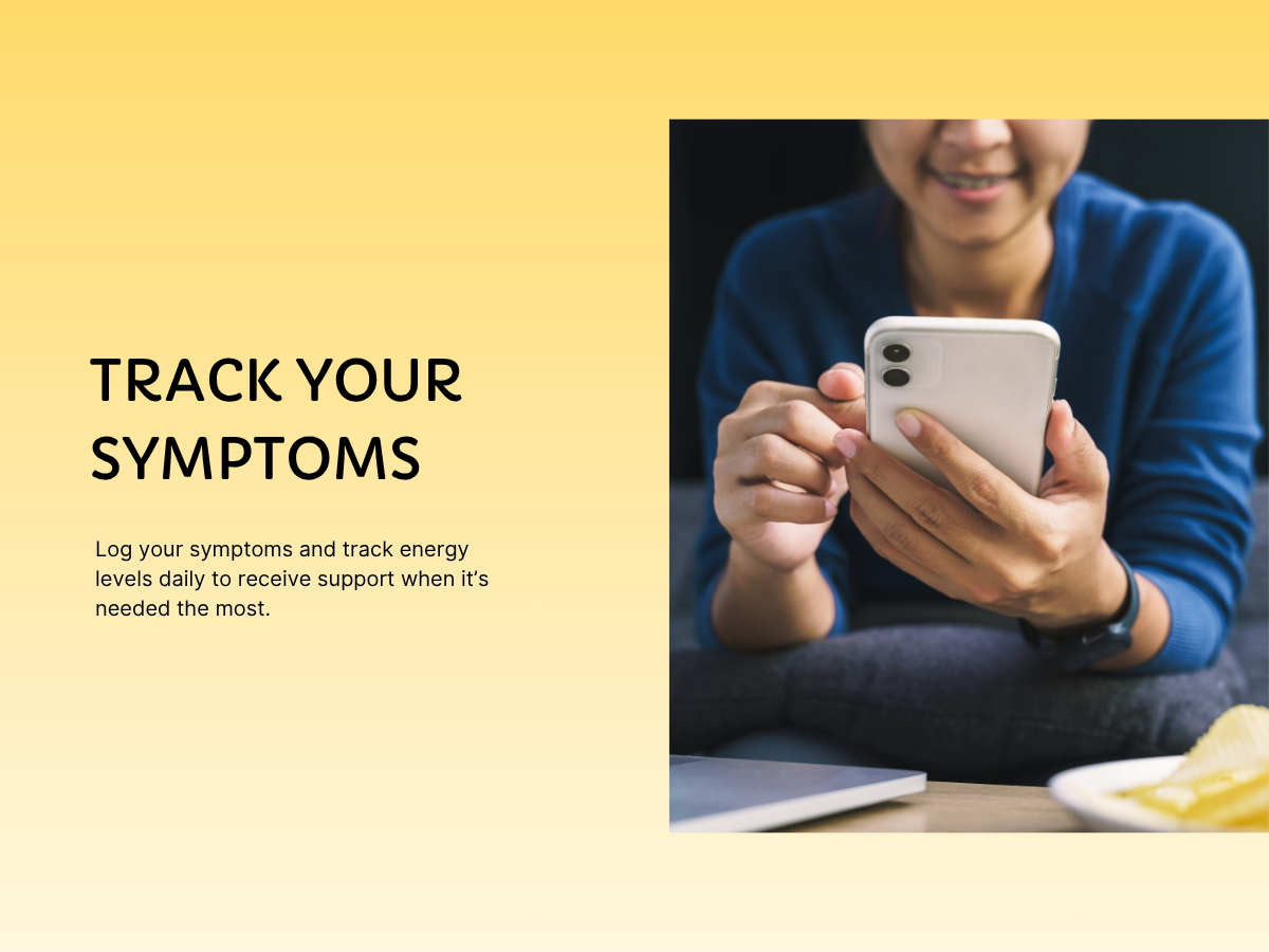
Independent individuals with chronic illnesses who struggle to ask for help and need understanding community support plus energy tracking tools to get assistance before reaching crisis points.
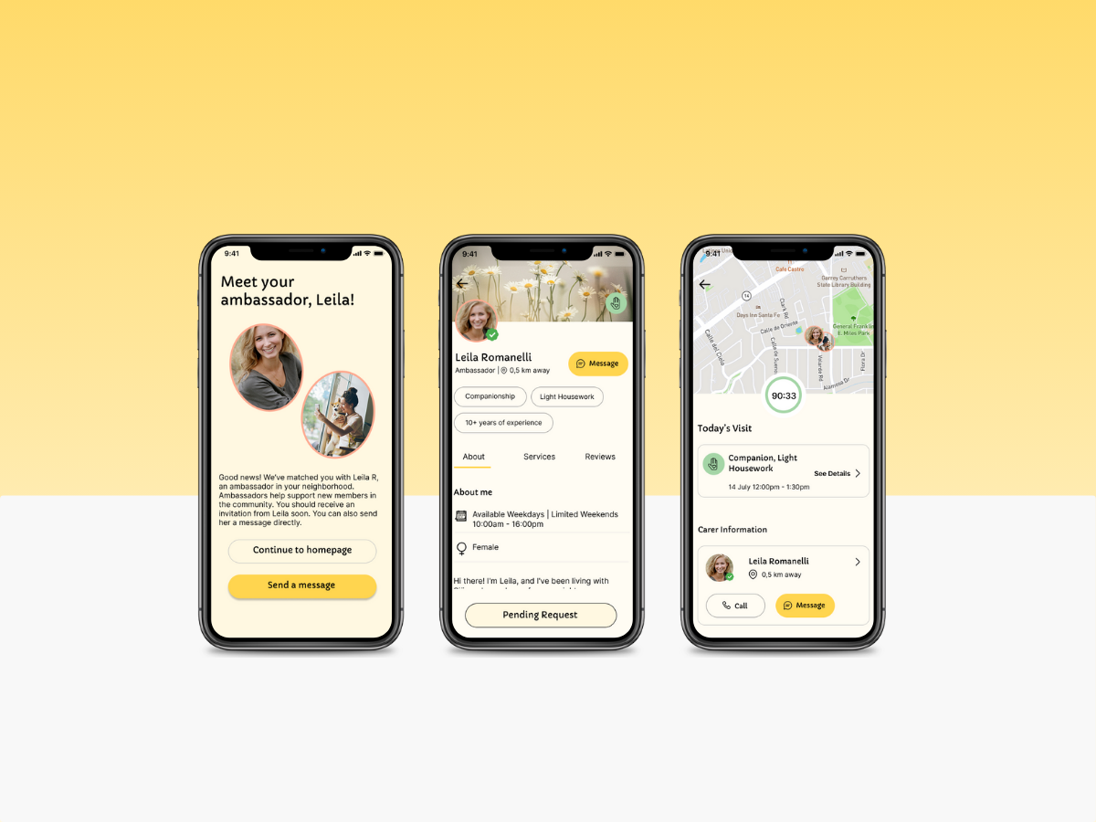
A peer support app that empowers people with chronic conditions by connecting them to a compassionate community, with proactive energy tracking and automatic help alerts so they never have to ask.
Human Research
I conducted in-depth interviews with 10 participants (ages 20–65), each managing a range of chronic conditions including chronic pain, autoimmune disorders, heart disease, Lyme disease, diabetes, and mental health challenges.
1. What's your age range? (18-25, 26-35, 36-50, 51-65, or 65+)
2. Tell me about any chronic health conditions you're managing.
3. What are your biggest day-to-day challenges in managing your health?
4. If you could wave a magic wand and create the perfect solution to help manage your healthcare, what would that look like?
5. How do you currently get help or support in managing your health?
6. What tools or services have you found that actually help?
7. What's worked well for you and what hasn't? Why?
8. Have you ever tried to get professional help with daily health-related tasks?
9. If you've tried hiring help before, how did that go?
10. What would make you feel comfortable getting help from someone?
11. Do you have any specific accessibility needs?
12. Is there anything else you'd like to share about managing your health that we haven't talked about?
Most important takeaway: Many are reluctant to ask for help, preferring support that feels proactive, non-judgmental, and personalized. Key unmet needs include affordable, consistent care, trustworthy assistance, and tools that reduce isolation while maintaining a sense of control.
Storyboard
Sitemap
User Flows
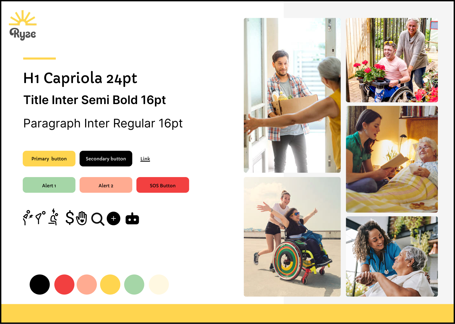
Moodboard
Typography
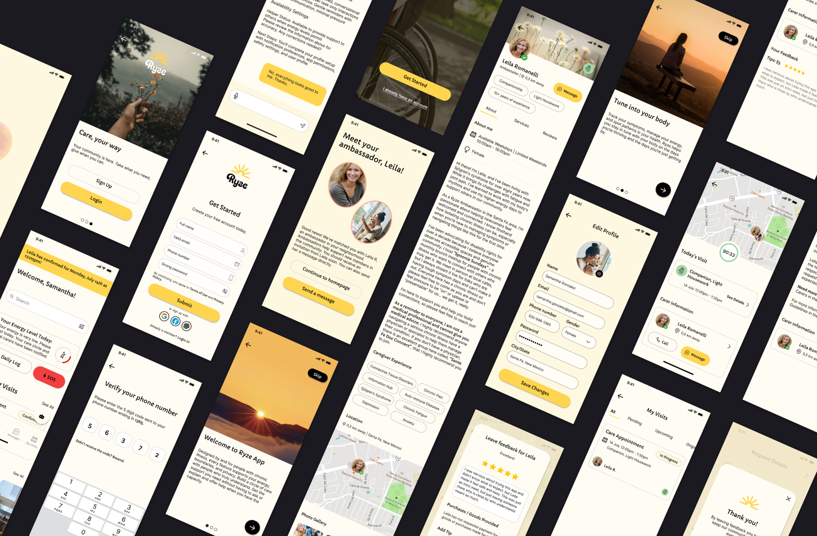
Low Fidelity Wireframes
High Fidelity Wireframes
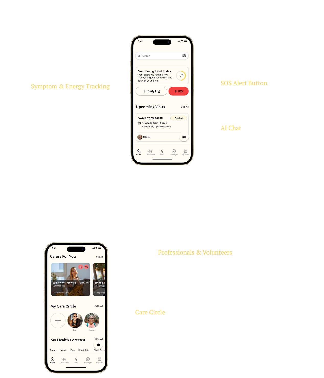
Prototyping
Usability Testing
Participants were invited to test two User Flows:
Analysis
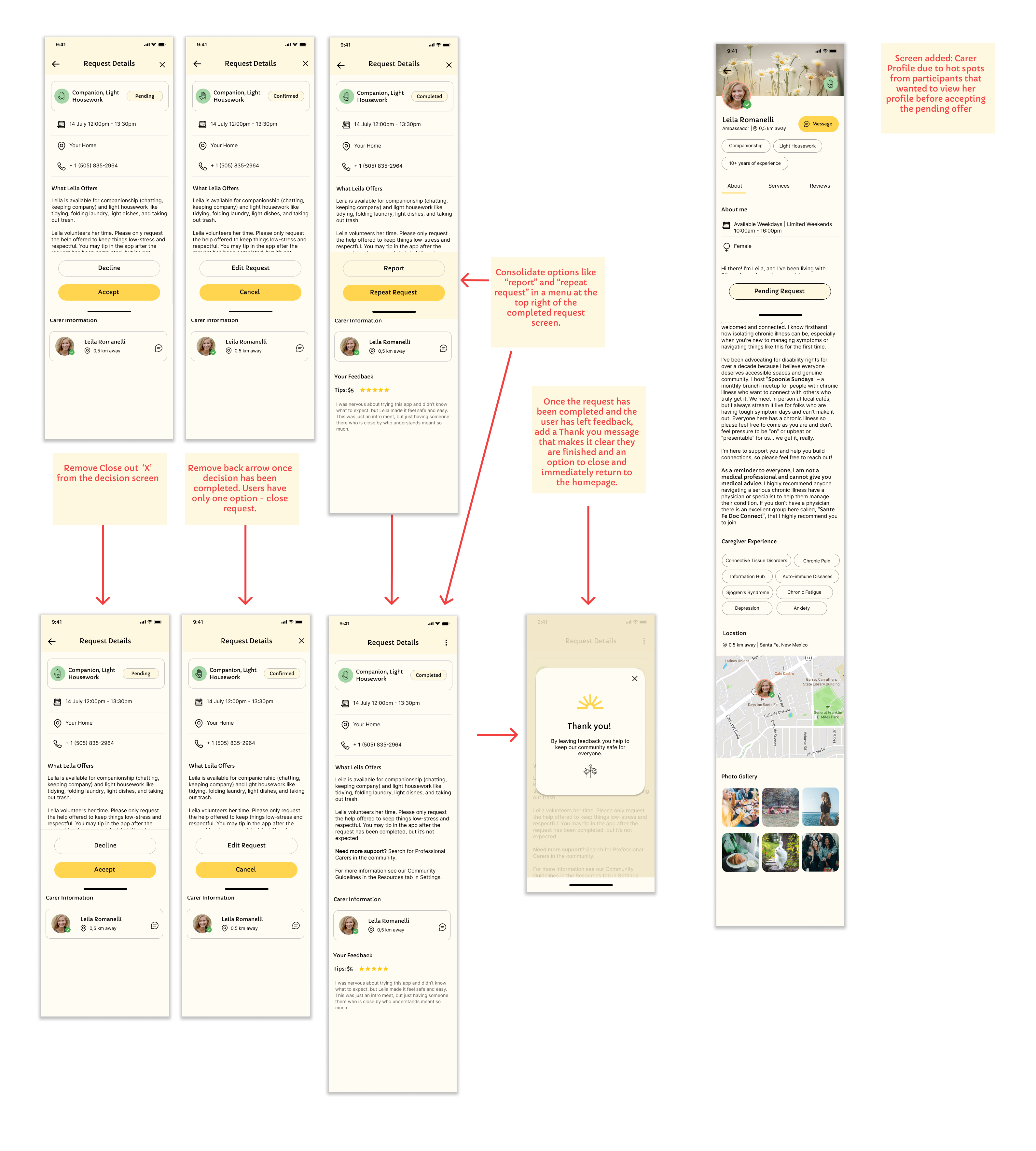
Based on usability testing, I focused on refining moments of friction that disrupted the user flow. This included adding an automatic closure to the request window after actions like accepting help or leaving feedback, and designing a simple, viewable profile for caregivers so users feel informed before accepting support.
.png)